Icon Links
On This Page
Just above you see On This Page being used. Handy for long pages. The Accordion field (below) can alternatively be used to condense long pages.
Body Field
This field's just for heading + text pairs.
Nothing fancy, just headings and paragraphs, potentially formatted as lists.
What's Not Here
This page has most fields, but some aren't:
- Header Image (example)- News is using that space.
- Logo (example) - This replaces the FACS logo at the top with another one. Good for separate units.
- Hide Menu (example) - This hides the left menu and makes the page wider. All elements grow to full width automatically. Great for if you want a strong visual presence and/or don't need the local menu.
- News options - This pulls in news in one of multiple ways; currently "Big Header" is used, but Small and Big Body are also options.
- Related People (example) "Job Description" option - This pulls in a related person, but emphasizes their job description.
- Image Grid - Checkerboard Option (example)
Want to see how these are defined in Expression Engine?
Click "Edit Page" at the bottom right of this page. Switch between the default tab and the Advanced tab to see the field definitions.
Let's Use Accordion
-
First Accordion
This field expands/collapses accordion items. Useful for long amounts of content that you'd like discoverable. The "On This Page Menu" field does something similar, in that it makes content on long pages discoverable.
-
Second Accordion
This is a field where you can define just the "Title" sub-field, and a heading will be output instead of the normal content.
Number Brags
Card Grid

Card Grid
This is the Card Grid. It is used when you'd like basic cards, each with an optional paragraph, and optional link from your title.

Next Card
You don't have to use the Link URL field within this field. You can simply link from this text if preferred.
-

Image + Text Field
Image + Text is handy if you want an image followed by some text. Typically this is for smaller images and larger amounts of text. For example, if you don't use the Related People field to automatically pull somebody's profile from the directory and you want to define it yourself, this is a good option (or Card Grid).
-

Another Image + Text
Image + Text is handy if you want an image followed by some text. Typically this is for smaller images and larger amounts of text. For example, if you don't use the Related People field to automatically pull somebody's profile from the directory and you want to define it yourself, this is a good option (or Card Grid).
Image Popups
-
Image Popup Field
-
Another Image Popup
Now for some built-in icons
Related People Field
Featured People Field

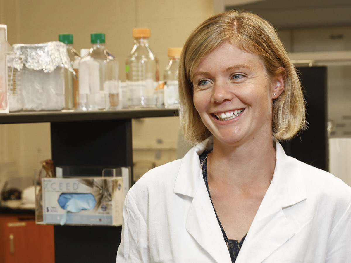
Claire de La Serre
Claire de La Serre studies the mechanisms that trigger overeating. She answers questions about her background and career so far at UGA.

Emma Laing
Clinical professor and DPD director positions students for success in their professional and personal lives. She gives them a research-based understanding of nutrition, diet and disease prevention.
- Questions / Answers Field
This is useful for anything that involves a question/answer, such as a FAQ or interview.
- Next Questions / Answers Field
If more than five items are added, an index with links will automatically be generated.
Logos Field
Next Logos
Wow, this is a lot of fields!
This is the Testimonials field. Wow, this is a lot of fields! As you can see, it's pretty neat. If you use the Standout Quote sub-field, it should be in the quote somewhere here. The full testimonial, here, can be long or short.


Standout quote
This is the full quote. It can be long or short. If long, a shorter version can be pulled out and placed above it.
-
Timeline
This is the Timeline field. The basics are date and title. But you can also add custom icon, paragraph and image for each slide.
-
Next Slide
The Timeline field is located at the bottom of the Advanced tab. Use it to make something like this.
-
Final Slide
Typically this field looks better with more width. You can do this by not including a Contact box or eliminating the local/left menu (Advanced > Hide Local Menu).


